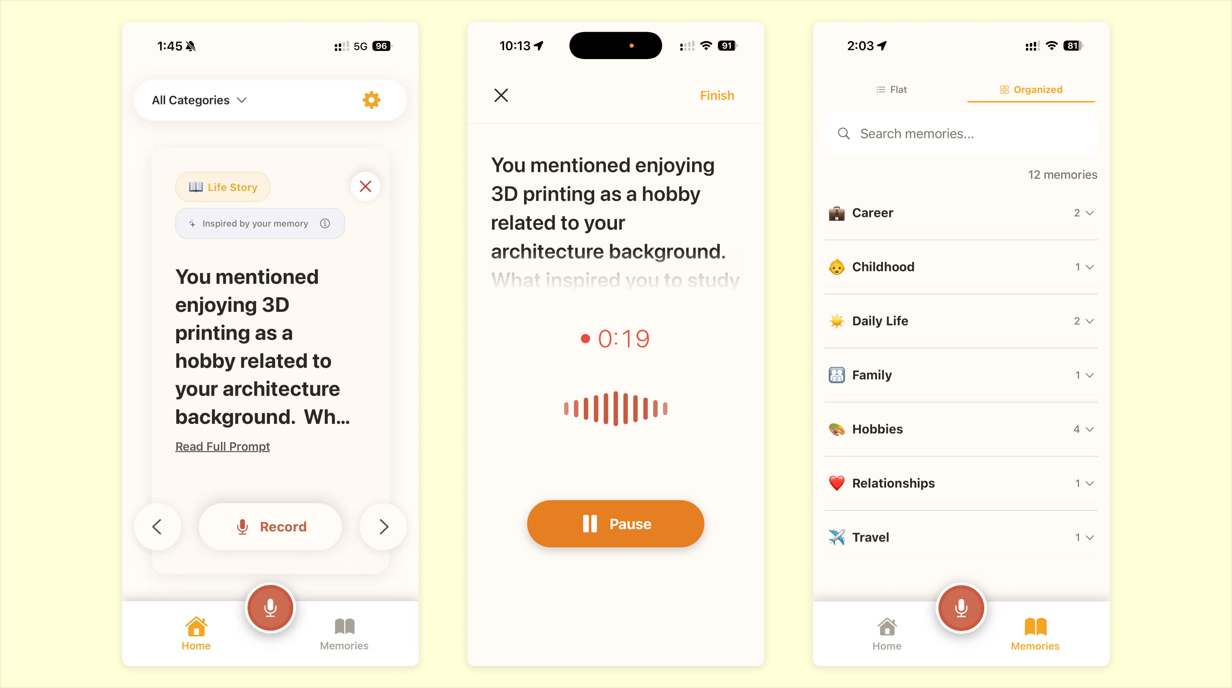
A voice-first app that helps older adults capture life stories.
Memoria is a voice-first iOS app for older adults who want to preserve personal memories. The hardest part is often not recording — it is knowing how to begin.
I designed and built the product end to end around swipeable prompts, voice recording, and AI transcription. It is currently live in TestFlight.
Many older adults have stories worth keeping, but starting can feel harder than remembering. Existing tools often assume users already know what they want to record. Memoria is designed around that first moment: helping people begin.
Instead of asking people to start from nothing, the app offers swipeable prompts that make entry easier. Users respond by voice, AI turns the recording into text, and each memory becomes part of a growing archive they can return to later.
In testing, one beta user in their 60s pressed Pause when they meant to finish a recording. However, they got stuck between Pause and Resume, unsure how to end the recording.
The original flow had been built with AI around a common recording pattern, but what I observed indicated the paused state didn't make the exit path clear enough.
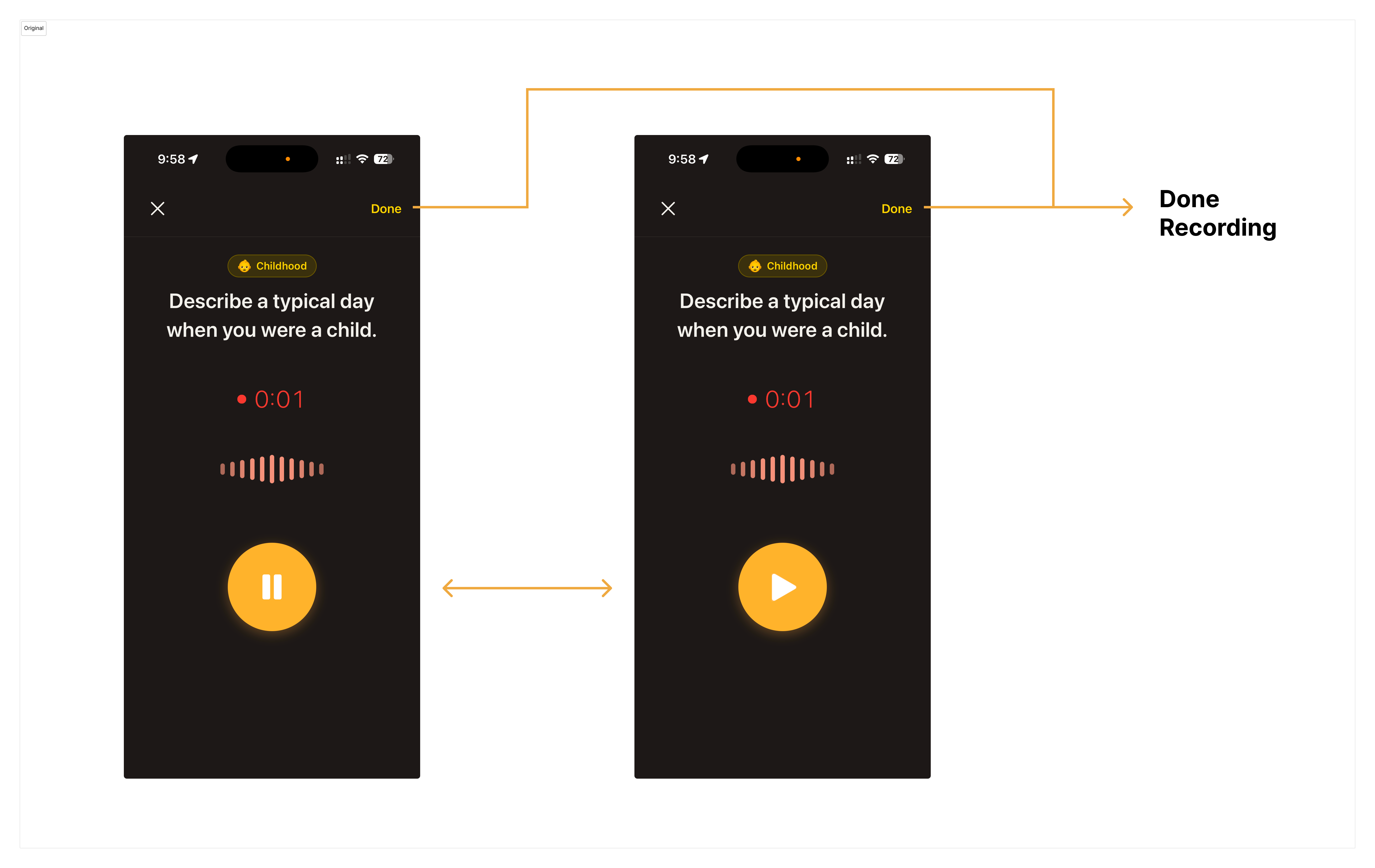
Reasonable at first, but unclear after pause.
Based on this observation, I realized the paused state needed a clearer way to finish the recording. I already had a direction in mind — surface a "Done" action near the main controls — and used Claude Code to quickly generate a first-pass fix without over-specifying the details.
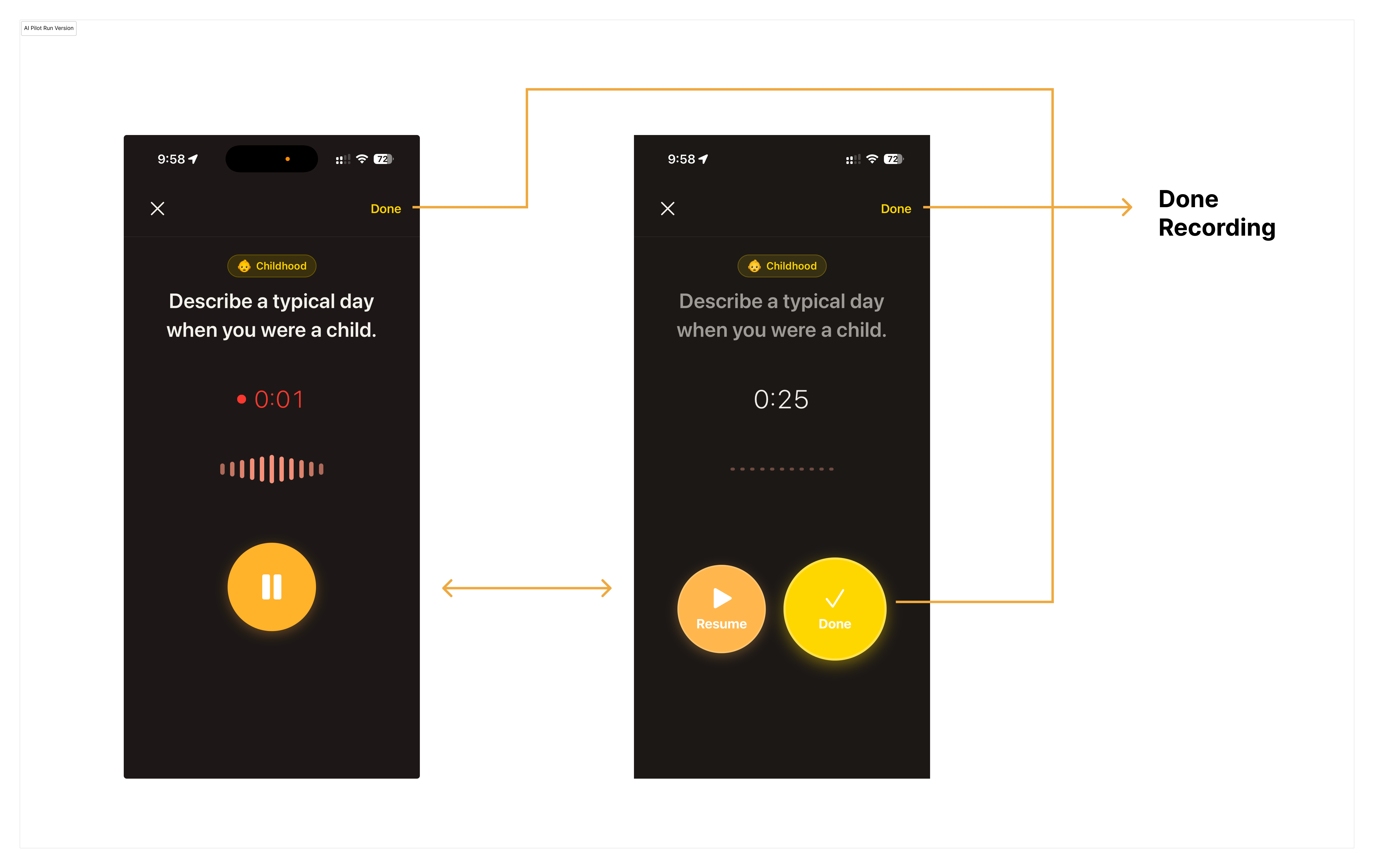
The first AI pass solved the immediate issue, but the interaction felt rough.
Functionally, it worked. But the interaction still felt unpolished — the buttons shifted too much, and the oversized Done action made the paused state feel visually uneven.
I then used what Claude Code generated as a base, and sketched in Figma to guide the next move. I explored two directions: one removed the top-right "Done" entirely and always showed two buttons, making the next step constantly visible; the other kept the top-right action as a consistent anchor, while adding a contextual "Done" after pause.
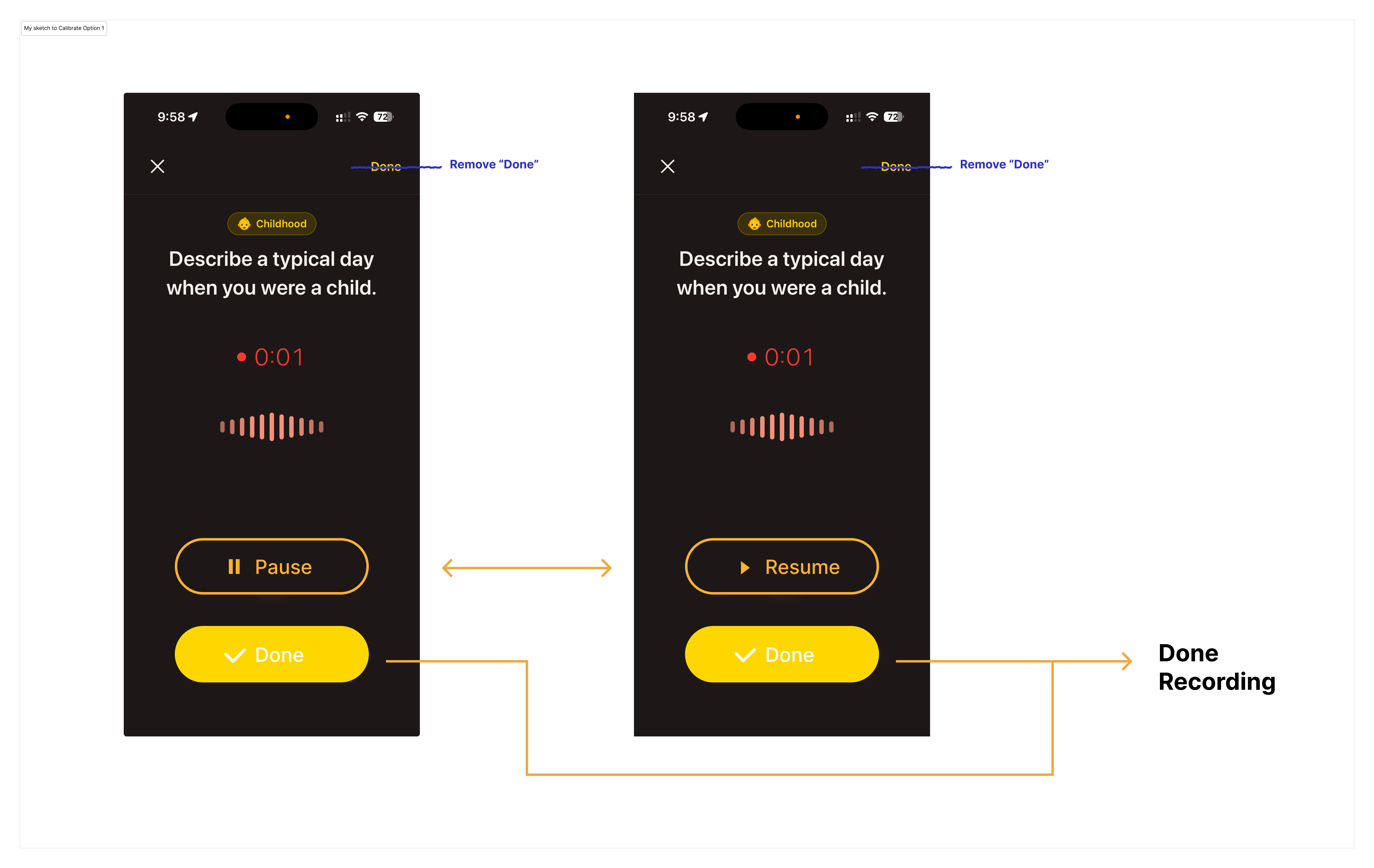
Direction 1 — removed the top-right "Done" and kept a persistent "Done" button near Pause/Resume.
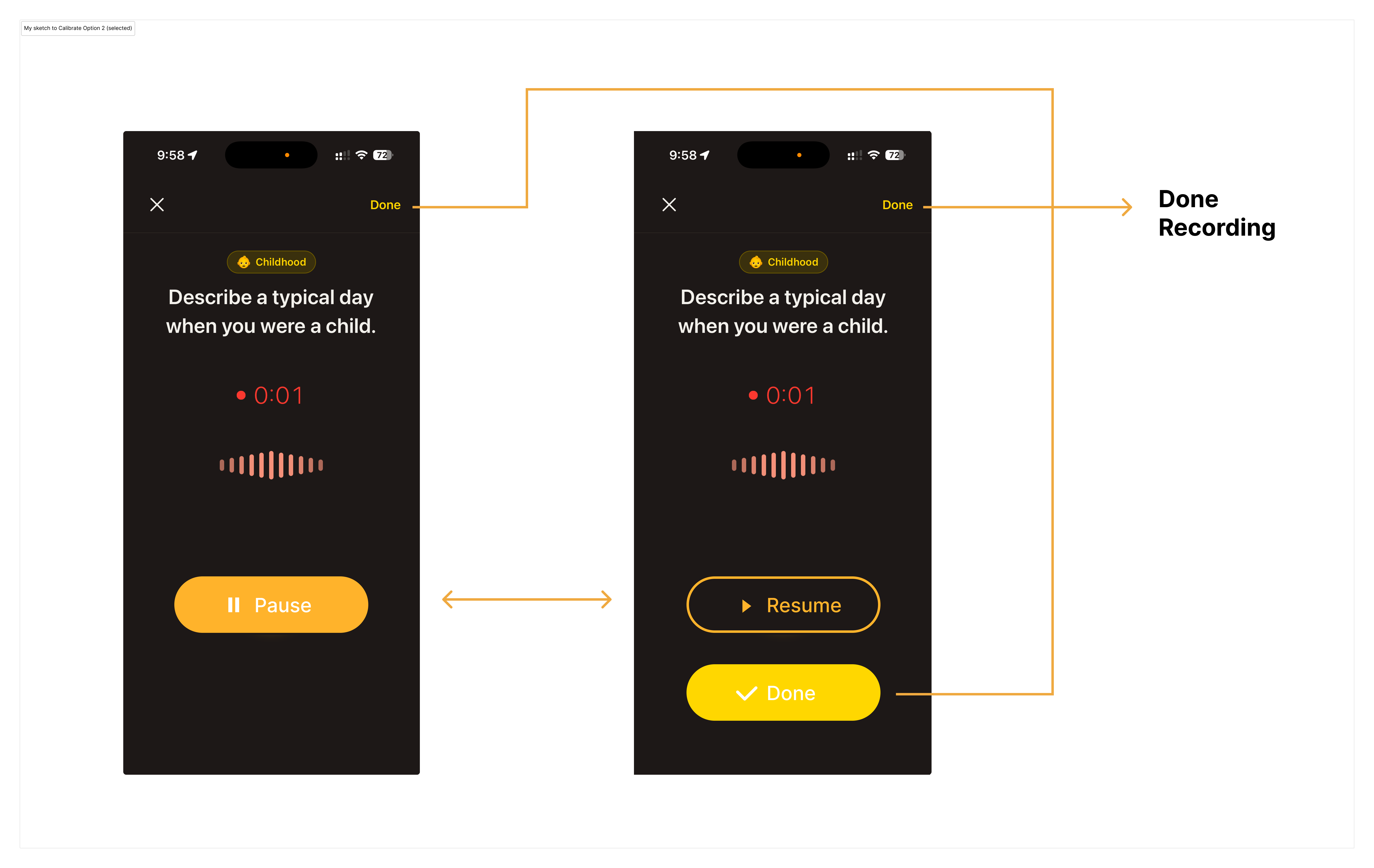
Direction 2 — kept top-right "Done" and added a second "Done" action after pause.
I chose direction 2 because it created a better balance between clarity, familiarity, and efficiency:
The next AI pass got the structure mostly right, but the visual execution still needed work.
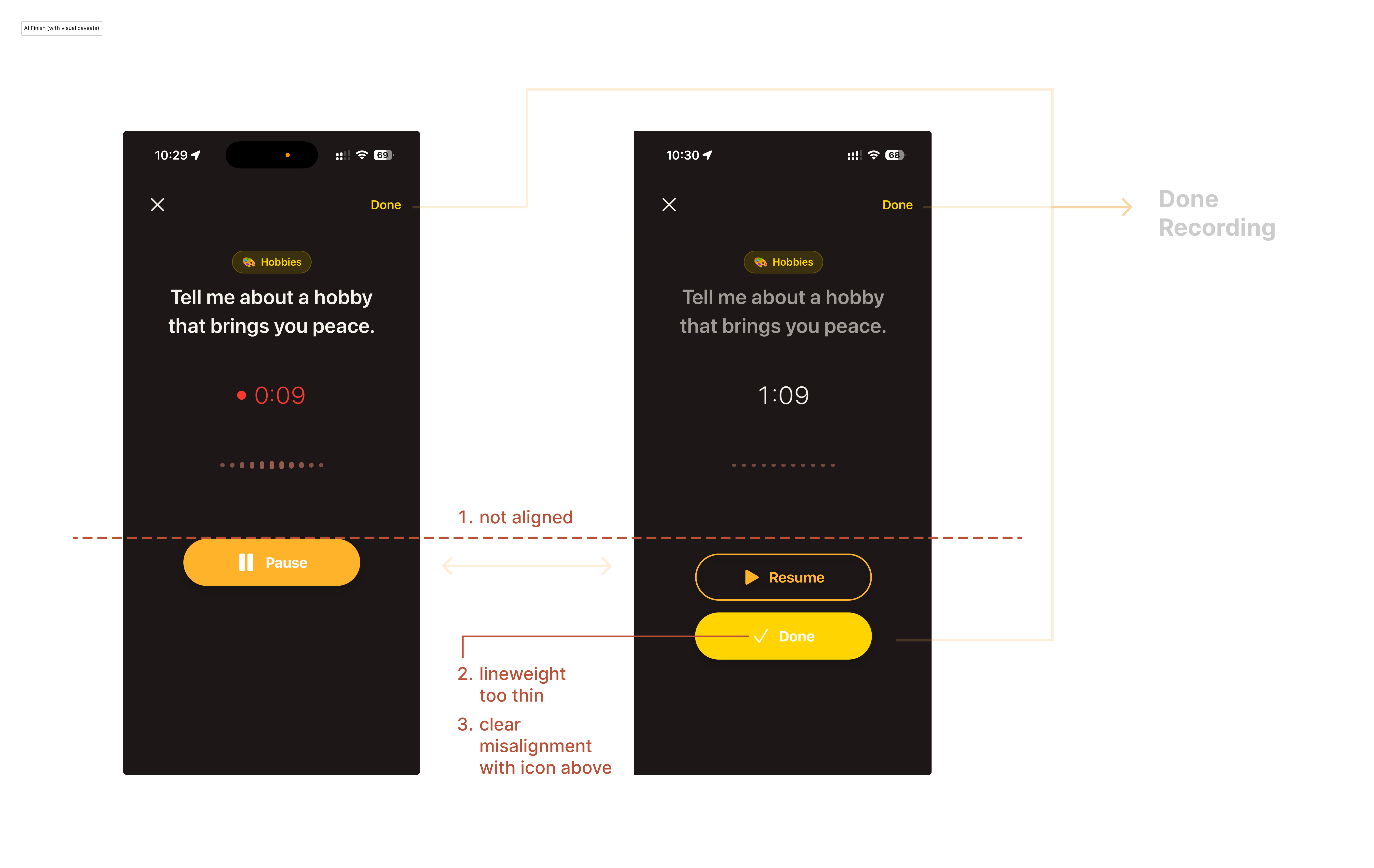
AI output — structure improved, but visual execution was still rough.
Based on this implementation, I created a calibration sketch to correct the alignment and improve the overall visual balance.
With the main issue largely resolved, a subtler problem became easier to notice: "Done" felt too vague in this context. I changed it to "Finish" to make the completion signal clearer and more explicit.
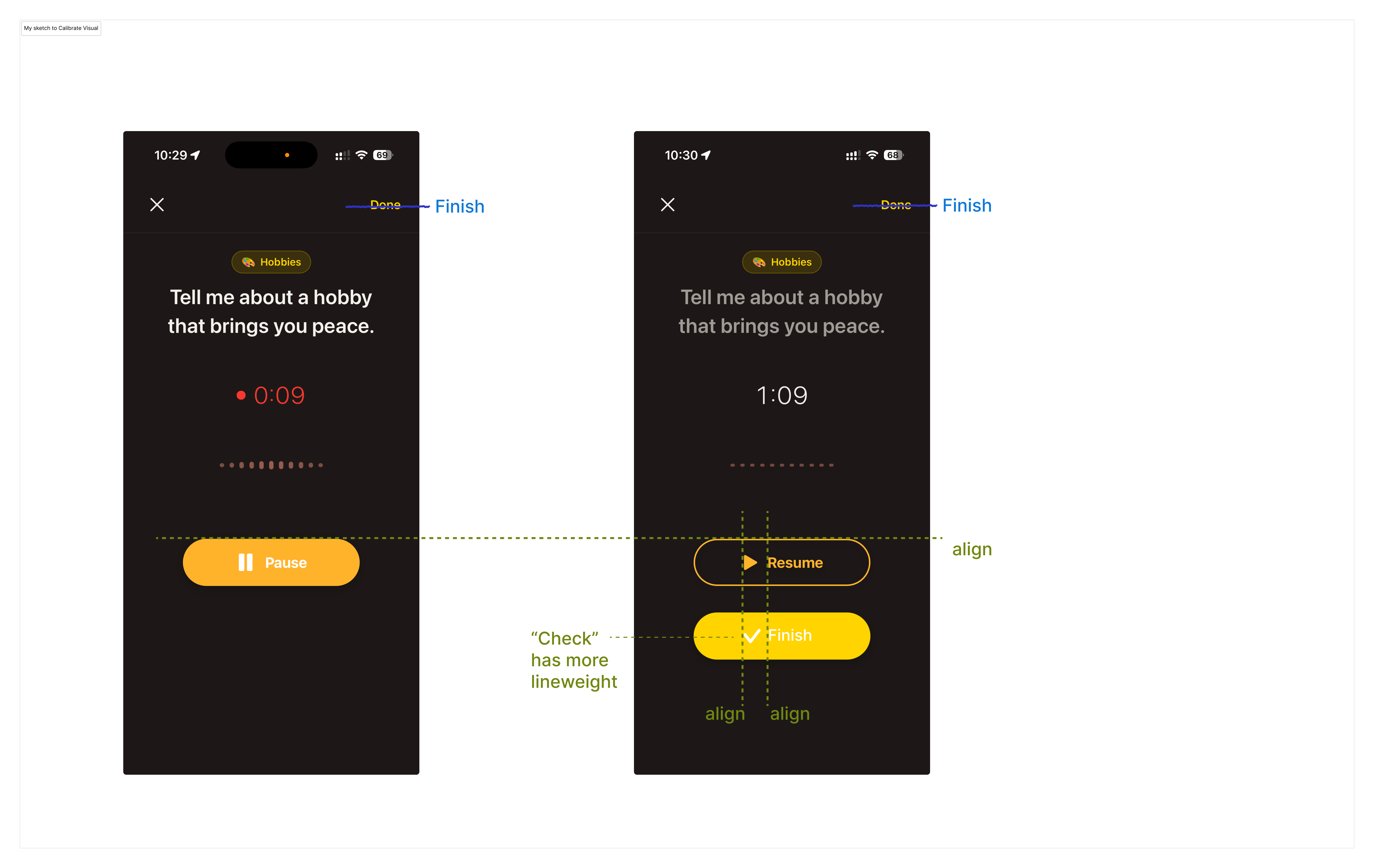
My refinements — alignment, icon weight, spacing, and label clarity.
After these refinements, ending a recording became a much clearer next step. In later testing, I no longer observed the same confusion in the recording flow.

AI got to a workable first pass quickly. What still needed a designer was judgment — what to keep, what to change, what to rename, and what still didn't feel right. That judgment is what turned a functional fix into a smoother recording flow.
Memoria is a solo product. I own the product decisions, visual design, and engineering. The current build is live in TestFlight, with ongoing work focused on onboarding, archive usability, and the interaction details that make the experience easier to return to.
I'm still actively updating Memoria. If you're interested and have an iPhone, you're welcome to try the current TestFlight build.